Part of the series: Shorthands
Three Shorthands
2019-11-23
I The New Abbreviations
Thus far I’ve designed and used three shorthands. The first was an alphabetic, orthographic shorthand, which I’ve written about in more detail elsewhere: The New Abbreviations. It originated as a project to correct my handwriting, which was crabbed, ugly, and above all, inconsistent.
It ended around 2017. Ultimately, I hit the limit of what you could do as long as you insisted on block lettering and preserving spelling exactly; the character set continued to increase in size as I came up with new glyphs to abbreviate certain combinations. At an aesthetic level, my one-time aversion to cursive had dissipated over the years; I was more interested in cursive forms (at the above link, you can compare the first image with the second to see how my own writing grew more cursive) and thus more tolerant of those schools of proper shorthand.
Having not set out to learn shorthand, after all, I had never had much motivation to learn a whole shorthand system. But my interest in other forms started percolating a little and so I decided to look around at what there was.
II Forkner/F-Minus
The two most famous shorthand systems are Gregg and Pitman. They have a lot in common, and what they have in common is largely representative of shorthands as a whole. They are phonemic/phonetic, rather than orthographic, designed to encode spoken word sounds rather than spellings.
This was a quality I had decisively opted out of when writing the New Abbreviations; it’s tremendously easier to reconstruct a word by spelling it out than by approximating its sounds and working backwards from there. And indeed, systems like this are much more demanding in terms of reading back. Nevertheless, you can compress quite a bit in terms of strokes and time if you ignore English’s famously crufty spelling and go straight to the sounds.
They are also non-alphabetic: they opt for simpler forms which are also more compressed than the Latin or any other alphabet. As a rule this makes them harder to read and write, again: your existing understanding of how to read and write will be of no use to you.
It also has the side effect of giving them an extremely low tolerance for variation. They are composed of extremely simple forms—mostly loops and curves—so in order to achieve the required diversity for representing the phoneme inventory of English as well as the standalone abbreviations for common words and phrases, relatively subtle variations on these forms will have significantly different semantics.
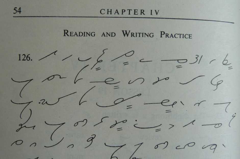
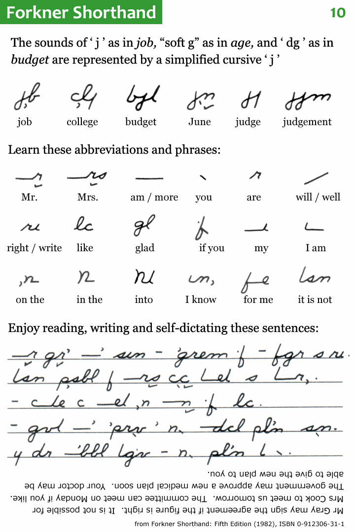
It was some of the above drawbacks, or at least learning-curve factors, which led me to adopt a ‘softer-core’ system: the alphabetic Forkner shorthand. Forkner begins with ordinary, cursive, longhand writing, and then replaces the letters with strokes and shapes representing sounds.
The resulting system is vastly less efficient that Pitman or Gregg, but much easier to learn. Easier to write, as you can use normal longhand as a basis and insert what you know.
I did end up changing it a bit to suit my own needs; that’s the version I call F-Minus. Some of the changes are relatively minor: for instance, the painstaking representation of vowels with curly apostrophes and commas seems completely unnecessary, so rather soon on those got straightened out into ticks when I was writing them. I also almost never combine multiple small words (qv. “may be able”, above) into a single outline; I find them very difficult to decipher and of fairly limited utility.
Some other changes were more substantive. The primary complaint I have with Forkner is that which it doesn’t bother to remove from longhand script. In particular, those parts of script which are more burdensome to write because as letters they don’t flow together particularly nicely.
You can think specifically of those lowercase letters which begin in the upper-right corner of the box1. Letters like c and d are fine to start off a word with, when you’re not traveling from the left, but awkward to connect to, as you must cross the body of the letter before starting it. I felt that they were actually the slowest and clumsiest part of my writing; thus I actually stopped using them in favor of more superficially complex letters, or existing ones with diacritics (k in the first case, and ṭ in the second). The combining dot below, as in the second example, ended up getting a fair bit of use. d became ṭ, ch became ɟ, v became ƒ̱. Putting a dot below a letter (or crossing a descender) becomes a kind of voicedness toggle on that letter.
With the changes came some slightly more involved rules about stroke choice. For instance, as mentioned above, letters like c and d are only clumsy when they don’t begin a word. So in F-Minus, you still use them if a word begins, for instance, with /k/. This minor optimization is also necessary to preserve the existing Forkner semantics of k, which is used to abbreviate the prefix contr-. Since we can assume we’ll only ever encounter that at the beginning of word, it’s safe to introduce the medial and final use of k as above without worrying that we’re introducing too much ambiguity.
III Something New
Learning Forkner, and then customizing it to my liking, certainly kept an awareness of Gregg, Pitman, and their varsity-level analogs in my mind. I suppose it was only a matter of time before I decided to take another swing at one, which happened only a few months ago.
I will confess that swing was unsuccessful. I decided I would learn Pitman; I think that’s partially because I liked the aesthetics better, but also because I was still wary of the error tolerance of the script.
As mentioned before: the simpler the forms, the lower the natural sign inventory, and thus the more subtle variations such as line width are depended on to represent different signs. Even at the best of times, and even after my self-training with the New Abbreviations, I don’t trust that I have the most consistent writing in the world. And given that I often write on the subway or the like, I’m aware that I am not going to have perfect motor control.
Between the two, then, I opted for Pitman; Pitman uses variations in line width to discriminate between signs, meaning that it has a wider graphical inventory than Gregg, and thus is hopefully more error-tolerant.
Error-tolerant it might be, but it’s still extraordinarily complicated. Moreover, I had never had to learn anything from scratch before which didn’t relate to what I already knew. So it was difficult to associate the still-subtly-varying curves of Pitman with their different sounds without a lot of rote memorization, which I simply didn’t have in me.
On the other hand—I’ve never had to write in any of these shorthands for another person. I’ve always been a speaker (or writer) population of 1. Which means, why not just make another one up myself? It’s a lot easier for me to remember something I came up with than something I read out of a book. And this way I could try to optimize for the qualities I find most important, especially that concept of error tolerance.
So for the last couple of months I’ve been putting together a Gregg/Pitman-style system for myself. The first thing to know is that it takes directly from Forkner/F-Minus wherever there’s nothing to improve. For instance: this system, like many others, focusses on the consonants in a word and leaves out the vowel sounds, or has them added as diacritics if required. The values for those diacritics are generally take directly from Forkner. So ′ above the stroke stands for a, whereas ′ below the stroke stands for o, and ` below the stroke stands for u.
The second thing to know is that the qualities being optimized for here are the same ones that led me to adjust Forkner to my liking and to shy away from Pitman and Gregg: ergonomics and error-tolerance. In contrast to the general assumption behind those and many other systems, that the most ergonomic strokes are those which underpin cursive handwriting, and that the strokes which underpin cursive handwriting are loops and curves, I’ve found that I have much better luck holding a steady line if I can alternate my curves with straight lines and acute angles. It’s in the oblique angles, along with one curve having to seamlessly turn into another, that my error rate goes up and the distinctiveness of the lines is most imperiled.
For those purposes I’ve made a couple general design decisions: I’ll minimize the meaningful variation within a stroke kind (at the expense of more writing, no doubt), and I’ll try to promote clear angles between strokes. For instance: instead of the 10 curving strokes that I count in the basic Gregg inventory, in my new system there are 2: long and short. In the realm of straight lines we allow ourselves slightly more extravagance, with 4 (to Gregg’s 9): NW/SE-oriented in long and short, NE/SW-oriented in long and short.
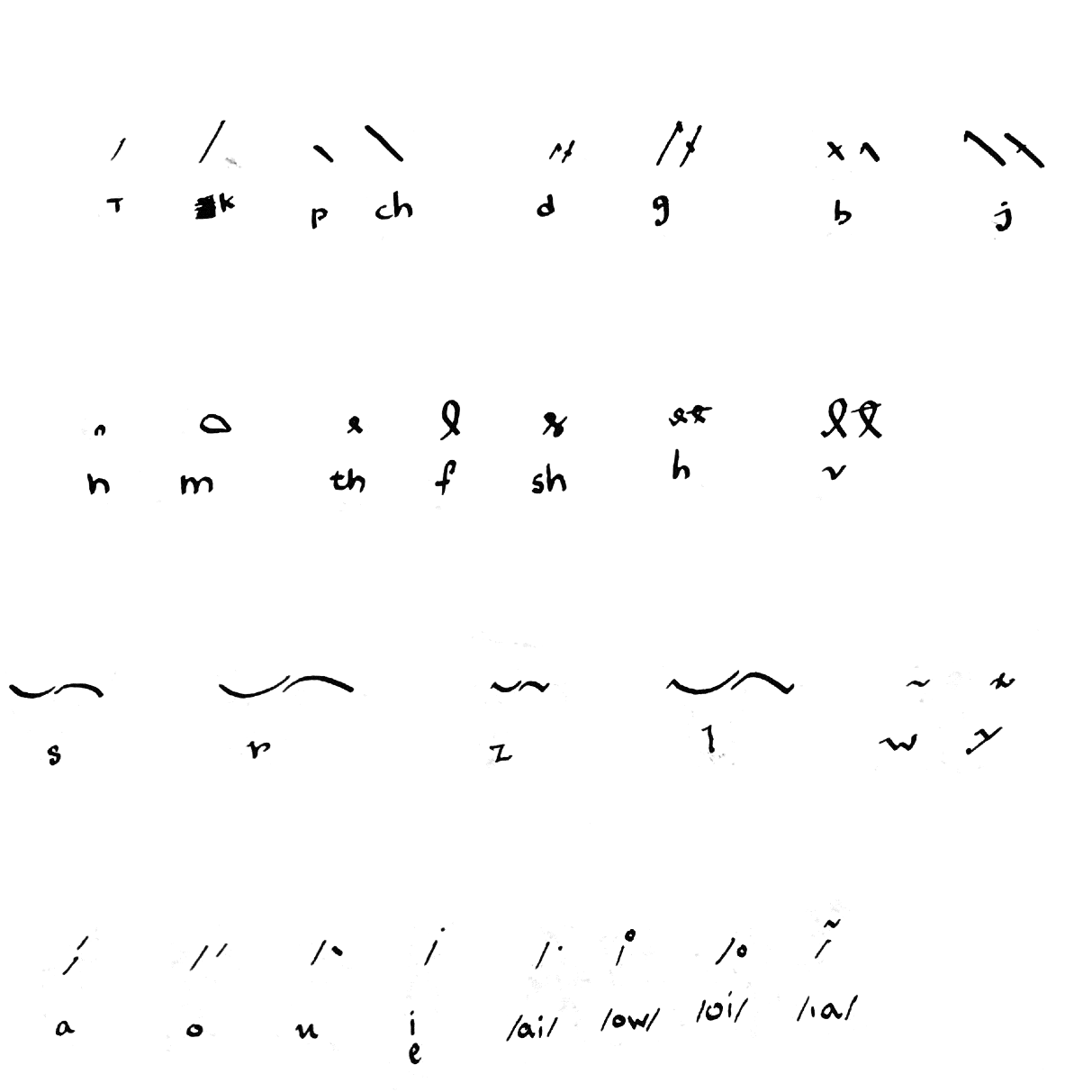
We extend this meager inventory predictably, with the vocalizing hatch mark that already showed up in F-Minus. So a short curve is /s/ and a long one is /r/, while putting a notch in that curve (or a little serif if the curve begins or ends an outline) makes /z/ and /l/, respectively. Similar schemes obtain for the lines: /k/ & /g/, /t/ & /d/, /ch/ & /j/, /p/ & /b/.
What’s important, and what determines a lot of the rest of the strokes that complement that basic scheme, is that every stroke have a vertical orientation; that is, it always be rendered “going up” or “going down”. That’s because the one true formal innovation (as far as I’m aware) of this system is how it treats blends, or consonant clusters.
So far I’ve been inclined to keep to a minimum those strokes which stand for common consonant sequences, as oppose to individual sounds. This is largely because of my self-imposed parsimony of strokes. I simply don’t have the solution space to apportion a separate kind of curve to /st/ or /nd/. However, one method that I have come upon of designating a consonant sequence without an intervening vowel—should it appear internal to a syllable or at a syllable boundary—is to control the relative orientation of the following stroke.
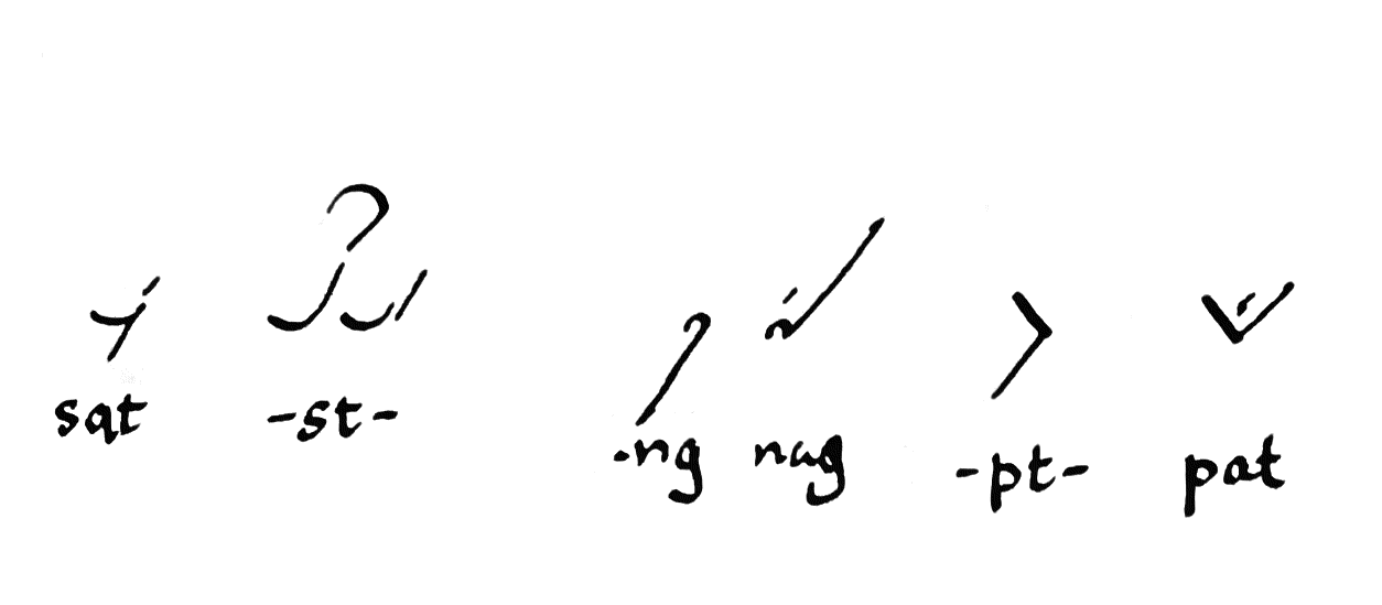
I’ll give an example: let’s say you have an s followed by a t, as mentioned above. That will be a short stroke followed by a short, NE/SW line. As a matter of fact, there are two ways to write each one of those strokes. The s can be a smile or a frown (so to speak), and then if you follow on with a t it can proceed up and to the right, or down and to the left. In this case, if this is beginning of a word, the choice of s is entirely arbitrary. Smile and frown are equivalent in meaning. But if you choose a smile, then we must pay attention to the orientation of the right side of that stroke. It’s pointing upwards. Now we have a semantics of blends: if you want represent st without anything in the middle, you continue the vertical orientation, and write a short straight line going up and to the right. If, on the other hand, you want to represent sVt, with some intervening vowel in the middle (sat, sit, set, soot, …), then you reverse vertical orientation, turning down and to the left.
Thus, every stroke in the system is always clearly pointing up or down.
This does a couple things for the system. First, if we assume that consonants are more often found on their own than in blends, it optimizes for the presence of acute angles between strokes, which is easier to read and write. Second is that it actually communicates a little bit more than what I know about systems like Gregg and Pitman (here I could easily be ignorant of something), in that even without adding a vowel diacritic, we can visually distinguish between CC and CVC. This—it is to be hoped—makes it more likely that an outline without any vowels will still be unambiguous, or indeed an outline where we haven’t bothered to differentiate between voiced and unvoiced.
There remain lots of edges to sand off. It remains to be seen how much
of and which of the Forkner word, prefix or suffix abbreviations can and
should be pirated wholesale into this system. Certain additional rules
and shortcuts are needed in order to, for instance, make it as easy and
forgiving to write and read a blend like the aforementioned upward s-t,
where both the horizontal and vertical orientation are the same, such
there’s no angle to differentiate between strokes. And it might be that
clever stroke design is not sufficient to avoid it being too onerous
to write certain long consonant sequences. And it’s certainly much
more demanding in memorization than Forkner or its modifications; I’m
still thinking my way through each outline. If that never accelerates,
of course, it will be interesting at best but entirely useless. It’s important to note that I’m left-handed and that fact has
significantly impacted the ergonomics of all of my writing. There are
letters and shapes which might be very uncomfortable for me but quite
normal for a right-handed person, and vice versa; thus I make no claims
for the universality of my ergonomic preferences. ↩
Built with Bagatto.