A Regular Simplification of Offenbacher Schrift
2020-11-22

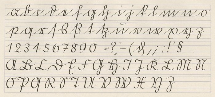
Above is a sample of Offenbacher Schrift, a style of handwriting designed by the type designer (and, regrettably, enthusiastic German nationalist), Rudolf Koch. Offenbacher Schrift was arguably the final incarnation of the venerable German handwriting style known as Kurrent, a tradition particular to German-speaking areas for hundreds of years, up until the Nazis fucked it up in some historically interesting ways. It’s closely related also to Sütterlin, which was the dominant form of Kurrent in its final flowering.
One of the attractive and interesting qualities of the Kurrent scripts, especially in comparison to English cursive, is their abhorrence of re-crossing and overlapping lines. For instance, the lower-case c: in English cursive, the pen, starting from the lower-left, slopes up to the top part of the c, and then doubles back along the same line to make the bottom part. This is studiously avoided in the Sütterlinschrift, which opts for the single minim.
It’s also this quality that is responsible for Offenbacher’s most extravagant peculiarities. There’s a lot that’s attractive about it (I’m someone who also has a lot of difficulty with those parts of the letter that have to cross over each other; when writing in cursive, I usually pick up the pen and start again when I have to write an a, c, d, g—in other words, when I have to cross from the bottom left to the upper right in order to start a letter), but unmodified, Kurrent is a little too eccentric to the Anglophone eye.
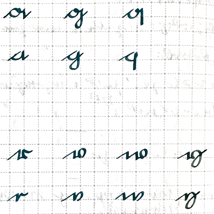
Let’s take a look at the eccentrics, a g q:

And r v w y:

We can see what’s happening here. In each case, the letter has acquired a little gap in it: in the top row, it bows downwards, and in the bottom row, it bows upwards, but in each case, the hand needs to establish a bit of distance between a straight stroke and a curve in order to ensure they don’t abut each other.


For my needs, this is the mania against the intermingling of lines taken to an unhealthy extreme. I want to avoid having to pass over a letter’s body in order to start it; on other hand, I’m perfectly comfortable with the round bit and the straight bit of my y rubbing up against each other. It’s the year 2020, after all.
Luckily for us, the regular construction of the script means we can apply an equally regular simplification. We can simply eliminate the gap in each of the above cases, and the regularity of it guarantees that we won’t end up with a mangled or inconsistent script.

This strikes me as a very fine compromise, having kept a lot of the regularity and cleanliness that I like out of Kurrent while making the letters generally a little simpler and more recognizable.
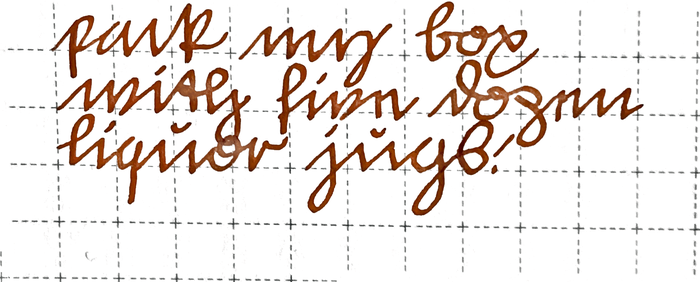
Here’s an example of the whole thing put together:

POSTSCRIPTUM
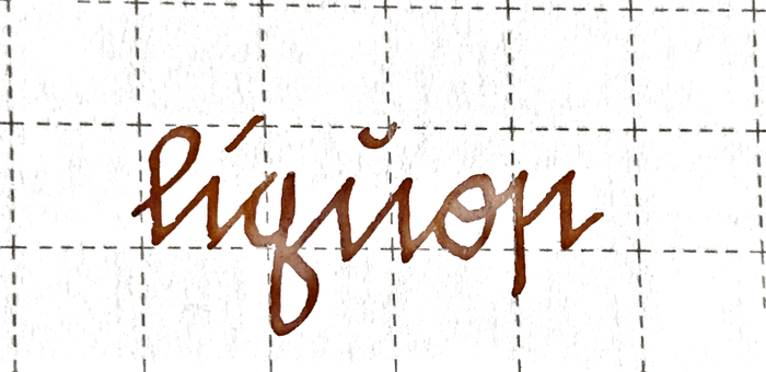
I’d like to offer one alternate rendering:
Arguably, the one outlier in the above is the treatment of r. It’s not necessarily that I don’t think the principle applies—I think that the short, bowed stroke on the bottom is a gap inserted to avoid the downstroke and the upstroke intermingling, and I think it can be eliminated in exactly the same way as the others are—it’s just that the r character is so minimal that, by accident or not, the gap-stroke is much more prominent in that letter than in the others. Especially when you consider that the last stroke, the curving one after the upstroke, will be the connector to the next letter (if the r isn’t last), one could make the argument that, visually speaking, the gap-stroke of the r becomes the dominant graphical feature of the letter and to eliminate it is to fundamentally alter its character.
In the spirit of that possible objection, I want to offer an alternative in the form of the insular r, ꞃ, which I have plucked out of its Irish origin and found to be a good match:

It works very well because its construction is almost identical to
that of the Kurrent e, with its two upright strokes and its
connecting stroke beginning midway-or-greater up the first one1. In
the case of the insular r, we simply give the first stroke a
descender. The degree to which the two share a character—while being
very clearly distinguishable—tells me that the substitution is quite
a natural one. Of course, it’s important that the connector starts midway up,
and not at the bottom, because otherwise it would be shaped just
like an n. ↩
Built with Bagatto.